From Scribbles to Stardust: Creating Art Beyond Imagination with Hand-Drawn Sketches and ChatGPT

Dancing Flower created by ChatGPT based on the scribble

Art has always been a conversation between imagination and medium. For centuries, that conversation required mastery of brushes, pigments, and painstaking technique. Today, something extraordinary is happening: a simple hand-drawn sketch—rough, imperfect, even childlike—can become the seed for breathtaking, otherworldly artwork with the help of AI.

And that changes everything.


The Beauty of Imperfect Beginnings

Look at the most powerful ideas in art history, and you’ll notice a pattern: they rarely begin as polished masterpieces. They start as marks. Lines. Gestures. Doodles in the margins of notebooks.
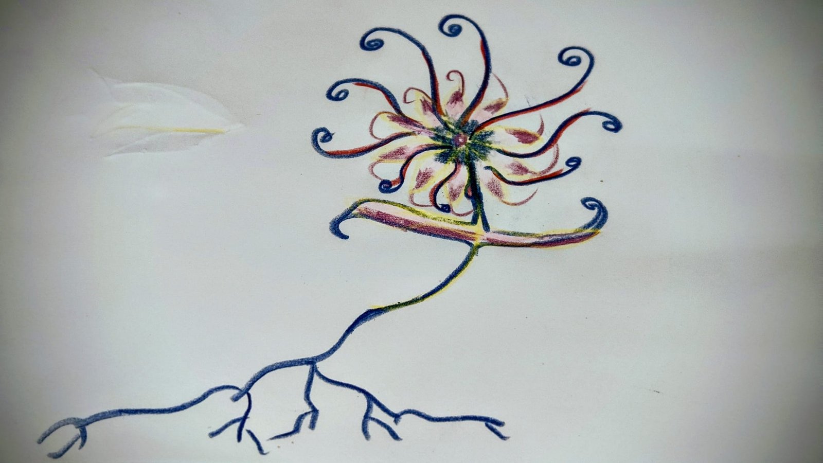
Original Flower Scribble

Those humble scribbles are not limitations—they are portals.

When you draw freely, without worrying about precision, you’re giving your subconscious permission to speak. A crooked stem, a looping petal, a strange curve that “doesn’t make sense” yet feels right—these become visual clues. They contain intention, emotion, and movement in their rawest form.

That’s where the magic begins.


Enter ChatGPT: Your Creative Amplifier

ChatGPT isn’t here to replace your creativity. It’s here to amplify it.

Think of it as a creative collaborator who:

  • Helps you describe your vision more clearly
  • Translates abstract feelings into vivid visual language
  • Suggests styles, moods, lighting, textures, and atmospheres
  • Pushes ideas beyond what you might initially imagine

You bring the spark. ChatGPT helps fan it into flame.

By combining your hand-drawn sketch with carefully crafted prompts, you can guide generative image tools toward results that feel intentional, personal, and deeply expressive.


The Workflow: Simple, Powerful, Accessible

You don’t need a studio. You don’t need expensive equipment. You don’t need years of training.

Here’s a beautifully simple process:

  1. Sketch Freely
    Draw something—anything. A strange flower. A dancing line. A shape that feels alive.
  2. Describe What You See
    Ask ChatGPT to help articulate the essence of your sketch.
    Example:
    “This looks like a whimsical flower with curling petals, glowing roots, and a sense of motion, as if it’s dancing in soft light.”
  3. Refine the Vision Together
    ChatGPT can suggest variations:
    • Dreamlike vs. photorealistic
    • Painterly vs. cinematic
    • Dark fantasy vs. luminous fairytale
  4. Generate and Iterate
    Feed the refined prompt into your preferred image generator. Adjust. Explore. Repeat.

Within minutes, a pencil doodle becomes a glowing, dimensional artwork that feels pulled from a dream.

1st Iteration of the scribble by ChatGPT

Why This Feels So Revolutionary

Because it collapses barriers.

  • You no longer need advanced technical drawing skills to express complex visual ideas.
  • You no longer need to “know how” before you begin.
  • You no longer have to translate imagination through a single narrow channel.

Instead, creativity becomes conversational.

You sketch.
You describe.
You explore.

Art becomes less about execution and more about vision.


A New Kind of Artist

This approach creates a new creative identity:

Not just painter.
Not just illustrator.
Not just designer.

But vision architect.

You design experiences, moods, and worlds.

Your role shifts from “Can I draw this?” to “What do I want to feel, see, and explore?”

That’s a profound change.


Collaboration, Not Automation

There’s a misconception that AI-generated art lacks soul.

The truth is the opposite.

When guided by a human with intention, curiosity, and emotion, AI becomes a lens—not a replacement. It reflects back what you feed into it.

Your sketch provides the gesture.
Your words provide the meaning.
ChatGPT helps shape the bridge between them.

The soul is still yours.


The Playground Has No Walls

You can create:

  • Alien botanicals that glow with inner light
  • Characters born from abstract shapes
  • Landscapes that feel half-memory, half-dream
  • Visual poetry that never existed before

All starting from a few imperfect lines.

That is extraordinary.


Final Thoughts

We are living in a moment where imagination is no longer constrained by technical barriers. If you can dream it—and sketch a hint of it—you can explore it.

So grab a pencil.
Make a mess.
Draw something strange.

Then open ChatGPT and start a conversation.

You might be surprised how far your scribbles can travel.

When Data Becomes Light: The Digital Alchemy of Daniel Canogar

In a world saturated with screens, streams, and torrents of information, Daniel Canogar stands out as a magician of light — a creator who doesn’t just show data, but transmutes it into immersive visual poetry and moving sculptures. Through his video installations and generative artworks, Canogar transforms raw flows of digital information into luminous, breathing compositions, inviting us to experience the intangible architecture of our data-driven lives.

Daniel Canogar

From Photography to Fluid Data — A Journey Through Media

Canogar was born in Madrid in 1964 and trained in photography, receiving a master’s degree from New York University’s International Center of Photography. https://www.mirabaud.com/en/contemporary-art/artists/artist/daniel-canogar

Yet, very early in his career he grew curious about the “projected image” — not just static pictures, but light, motion, space, and time. https://www.danielcanogar.com/bio

Over the decades, his practice evolved beyond photography: he experimented with fiber optics, video projections, recycled electronics, and — now — real-time data streams. https://www.meer.com/en/60589-daniel-canogar

For Canogar, objects like old VHS tapes, hard drives, obsolete electronics aren’t mere trash — they are archeological artifacts of a vanished analog era. By projecting onto them, he resurrects forgotten memories and highlights the impermanence of technology and memory. https://www.meer.com/en/60589-daniel-canogar


Data as Palette: Translating Information Into Art

One of the most distinctive traits of Canogar’s work is how he transforms data itself — from financial markets to news feeds, from social attention metrics to historical artworks — into rich, moving visual experiences.

What makes these works different from mere data visualization — charts, diagrams, dashboards — is that Canogar doesn’t aim to clarify. Instead, he embraces abstraction, ambiguity, emotion: the goal is not to inform, but to evoke. As one observer noted: “the palette of these artworks is not painting, but rather data.” https://www.artsy.net/article/mark-moore-fine-art-mirrors-data-works-daniel-canogar


Light, Memory, and the Fragility of Digital Existence

Underneath the technical brilliance and hypnotic visuals lies a deeper preoccupation: memory, impermanence, and what gets lost when technology evolves.

By projecting onto discarded electronics — DVDs, hard disks, cables — Canogar taps into a collective nostalgia, a memory of personal and shared times stored in these now-forgotten objects. https://www.meer.com/en/60589-daniel-canogar

He sees digital media not as a final frontier, but a sediment — layers of memories, data, context — that accumulate, shift, vanish. His installations often feel like attempts to hold on to that fluid past, to give shape and light to what otherwise remains intangible. https://www.thelightobserver.com/daniel-canogar

As he once said: after the magic of discovering the photographic darkroom as a teenager, “I realized I’m always trying to recreate that magical enchantment … now through algorithms, huge projectors, LED screens.” https://www.niio.com/blog/daniel-canogar-im-trying-to-find-inner-peace-in-this-world-of-excess/


Public Space as Canvas: Blurring Boundaries Between Digital & Physical

Another defining feature of Canogar’s work is its site-specific and often public-space dimension. He doesn’t confine his art to galleries — he spills it into urban spaces, airports, museums, and monumental façades. https://zkm.de/en/person/daniel-canogar

Whether it’s a flexible LED sculpture curving through the atrium of a bank headquarters, or projection animations crawling up the walls of iconic buildings — his art challenges the viewer’s concept of where art belongs. https://www.mirabaud.com/en/contemporary-art/artists/artist/daniel-canogar

In doing so, he asks: how does the digital age reshape our public spaces? How does the constant flow of information infiltrate our shared physical environment? Can we find a new kind of public sphere, where data and memory become visible and collective? https://linkedspheres.art/daniel-canogar


Why Daniel Canogar Matters — And What His Work Reflects

In an era where our lives are increasingly mediated by screens, algorithms, feeds, and streams — almost always unseen layers of code — Canogar’s work is important because it makes the invisible visible.

  • He doesn’t just display data — he feels it, sculpts it, breathes light into it.
  • He reminds us that behind every “data point” lies human experience, memory, culture.
  • He connects analog pasts with digital futures — reclaiming discarded technology as vessels of collective memory.
  • He questions what it means to be human in a world where identity, art, history, and memory are increasingly bound up with data.

To encounter a Canogar installation is to confront the vastness of our digital milieu — but to do so as poetry, not panic.


Final Thought: Data Is Not Just Information — It’s Living Light

If data is the new oil, then Daniel Canogar is one of the world’s most graceful and mindful refineries. With sensitivity, imagination, and technological mastery, he turns cold, abstract 1s and 0s into warm, pulsing lights; noisy, chaotic streams into meditative mosaics; fleeting online moments into lasting visual memories.

In his hands, data becomes not a commodity — but a canvas. A reminder that our digital lives, for all their intangibility, leave traces: light and shadows on walls, memories flickering in LED glow, the ghost of old hard drives dancing again.

And maybe that’s what we need now: not another chart or graph — but art.

The Art Trend Redefining 2025

A new wave of creativity is exploding across the art world — bold, fluid, unpredictable, and utterly mesmerizing. Welcome to The HyperFluent Movement, the latest art trend capturing the imagination of painters, digital artists, NFT creators, interior designers, and futurists alike.

HyperFluent art is all about motion, emotion, and transformation. It blends kinetic energy with surreal color patterns, creating living visuals that feel like they’re breathing on the canvas. Think of it as a fusion between liquid metal, neon dreams, and abstract consciousness.

Hyperfluent Artwork
Hyperfluent Artwork

What Makes HyperFluent So Unique?

  • Fluid Dynamics as Art: Each piece feels like it’s in motion, even when completely still.
  • Chromatic Emotions: Artists use shifting color gradients to express raw feelings — from cosmic calm to electrified energy.
  • AI–Human Collaboration: Many creators blend traditional techniques with AI-powered morphing tools to achieve impossible textures.
  • Multi-Dimensional Design: HyperFluent works often mix 2D and 3D elements, creating art that feels like it’s leaping out of reality.

Why It’s Taking Over

As society moves deeper into the digital era, people crave art that reflects constant change. HyperFluent captures that restless transformation beautifully. It’s being featured in galleries, viral TikTok art videos, futuristic branding campaigns, and even VR spaces.

Interior designers are calling it the “aura art” of the decade because its glowing fluid forms instantly transform a room.

What You’ll See in a HyperFluent Piece

  • Metallic, liquid-like surfaces
  • Flowing ribbons of neon or iridescent color
  • Abstract shapes shifting in form
  • Movement implied through warped reflections
  • A dreamy, hypnotic sense of depth

This movement doesn’t just look mesmerizing — it feels alive.

Think out of the box

Really new thinking? And new possibilties?

The image features a simple banana transformed into a quirky piece of art. Its peel has been carefully inscribed using nothing more than the fine tip of a pin, gently scratching the surface to form letters. At first the markings appear faint, but with a bit of patience—and a little time—the etched areas begin to oxidize. As the banana’s skin naturally browns along the engraved lines, the text gradually emerges in bold contrast against the still-yellow peel. It’s an easy, organic way to turn an everyday fruit into a playful message or miniature canvas, all thanks to a bit of chemistry and a very steady hand.

The Narrators’ Line

Anise Gallery brings together the work of Alex Schramm and Kyle Henderson, two artists inspired by their architectural training to produce exquisite linework relating to theories of biology, industrialisation and ethnography.

Kyle’s improvised compositions meander across the canvas on a creative journey whilst Alex’s biomimetic forms translate otherworldly visions into rigid working drawings, both maintain the precise attention to illustrative detail one would expect from the hand of an architectural illustrator.

Despite working with abstracted realities, they still operate in an architectural manner; developing briefs, resolving details and reworking the creative idea until it is a cohesive project, from the smallest canvas to the large installations the process is the same.

In The Narrators’ Line both these artists reinterpret scale so that it exists as an ambiguous vehicle to transport the viewer between the molecular and the metropolitan. Architecture without scale puts you in the shoes of Alice in a wonderland of architectural imagination.

28 July – 26 August
www.anisegallery.co.uk

Color psychology: How to influence people by choosing a specific color.

Did you know that back in the 1970s, McDonald’s deliberately used orange as one of its key interior colors? It wasn’t a random design choice — it was rooted in color psychology. Fast-food chains of that era were early adopters of the idea that colors could influence how people feel, behave, and even how hungry they become.

Orange was believed to be a warm, energetic, appetite-stimulating color. It created a sense of vibrancy and excitement, subtly encouraging guests to feel hungrier and more eager to eat. Paired with reds and yellows — colors that are still iconic in the McDonald’s brand — the overall effect was meant to make the dining environment feel lively, fast-paced, and inviting.

But there was another layer: these bright colors were not only used to spark appetite, they were also strategically chosen to encourage faster turnover. Bold, intense hues tend to make people eat quicker and leave sooner, which perfectly aligned with the fast-food model.

Over time, McDonald’s design philosophy evolved. The brand gradually shifted toward more neutral, calming interiors — grays, soft woods, muted greens — creating a more relaxed atmosphere as dining habits changed and the chain aimed for a more contemporary café-style feel.

Still, that 1970s orange era remains a fascinating example of how brands have long used psychology and design to shape the dining experience, proving that even the color on the walls can influence how we experience our food.


20120503-213512.jpg

This way to the burgers..no not quite like this, of course much more subliminal.